Another obvious way in which maps are conventional is in their use of 'projection'. No curved surface like that of the Earth can be projected in two dimensions without some distortion. Over the years many different modes of projection have been developed: some are better for conveying such elements as shape or size; some, for compass direction or relative position; some are more distorted toward the poles; some, towards the equator. No one projection is the best or the most accurate. A particular projection is selected by the mapmaker on the basis of functional and perhaps aesthetic criteria, or because of a specification or convention.

2.2
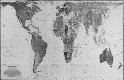
The Peters projection maintains north-south and east-west directions and preserves the relative size of countries at the expense of shape.

2.3
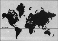
The distorted area effect of Mercator's projection. The area of Greenland is 2 176 000 square kilometres; the area of Australia is 7 690 000 square kilometres.
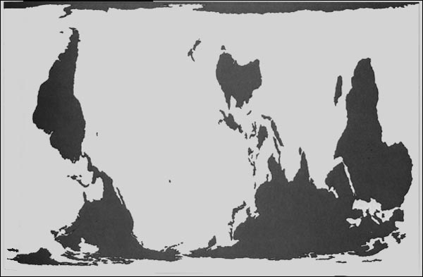
The projection developed by Gerhard Mercator, a Flemish cartographer, in 1569 became the most commonly used projection because it portrayed compass directions as straight lines. However, this was achieved at the expense of distortion of relative size, especially towards the poles. Mercator's Greenland appears much larger than Australia, which is in reality more than three times the size of that North Atlantic island. But other more subtle effects result from Mercator's view of the world. If you compare the Mercator projection (ITEM 2.1) with the Peters projection (ITEM 2.2), a map which endeavours to preserve relative size, what differences do you discover which might have cultural or political significance? You may wish to ask yourself what interests are served in a Mercator projection. Is it a coincidence that a map which preserves compass direction (a boon for ocean navigation) shows Britain and Europe (the major sea-going and colonising powers of the past 400 years) as relatively large with respect to most of the colonised nations? (See ITEM 2.3.) What if we turn the Peters projection upside down and centre it on the Pacific? (See ITEM 2.4.) A profoundly altered view of the world is obtained.

2.4
The Peters projection inverted and recentred.
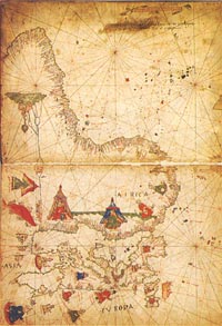
Of course, orientation is an arbitrary convention (see ITEM 2.5 and Contents page). Indeed, the very word orient-ation comes from 'East' being the direction of the rising sun and hence it was once common practice to put it at the top of the map. North, whilst being one end of the Earth's axis of rotation, is not a privileged direction in space, which after all has no 'up' or 'down'. That North is traditionally 'up' on maps is the result of a historical process, closely connected with the global rise and economic dominance of northern Europe.

2.5
Africa with south at the top, reflecting the perspective of the explorers of the day (Vesconte Maggiolo, 1512).
Another early example of map orientation reveals several interesting points (see ITEM 2.6). This map, produced less than 100 years after the Spanish conquest of the Inca, was drawn by the Quechua writer Hawk Puma (Guaman Poma) to illustrate his moving account of Spanish misrule of Peru. Because his manuscript was part of a petition to the Spanish monarch, Hawk Puma employed a number of European conventions: he called it Mappamundi; he put 'North' at the top; he added pictorial elements such as the sun, ships, mountains, buildings in the towns and cartographically familiar sea creatures. The map shows little connection with the sophisticated relief maps which the 17th-century historian Garcilaso de la Vega attributes to the Inca, and it thus appears to avoid Incan cartographic conventions in favour of the European.
To modern eyes, the Hawk Puma map may at first seem fairly 'primitive', bearing, as commentators have suggested, only limited relation to the actual landscape depicted. For example, neighbouring countries seem to be wrongly placed, with the Pacific to the south instead of the west. But what happens if we rotate the map? Suddenly all the geographical relations fall into place. Even the rivers, the Maranon, Amazon and Pilcomayo begin to flow in the right directions again.